Making a Dementia-Inclusive Resource Centre
Take a virtual tour of our Dementia-Inclusive Resource Centre! Learn about the changes we’ve made to our provincial office to make it more inclusive for people living with dementia.
When the opportunity arose during a planned renovation to our office space, we decided to incorporate elements of dementia-friendly design to make our space more inclusive for people living with Alzheimer’s disease and other forms of dementia.
People living with dementia may experience visuo-spatial changes, changes in depth perception, impaired reasoning and difficulty navigating spaces. With this in mind, we wanted to ensure that we made spaces, objects and devices clear, familiar, usable and free from clutter.
The information that follows highlights our learning journey, and is intended to demonstrate how simple changes that you can make at home, at work, or in your community can have a measurable impact on those living with dementia.
We would like to take you on a tour of our Dementia-Inclusive Resource Centre! Take a look at some of the changes we’ve made to our office that you can consider implementing, too!
General design tips
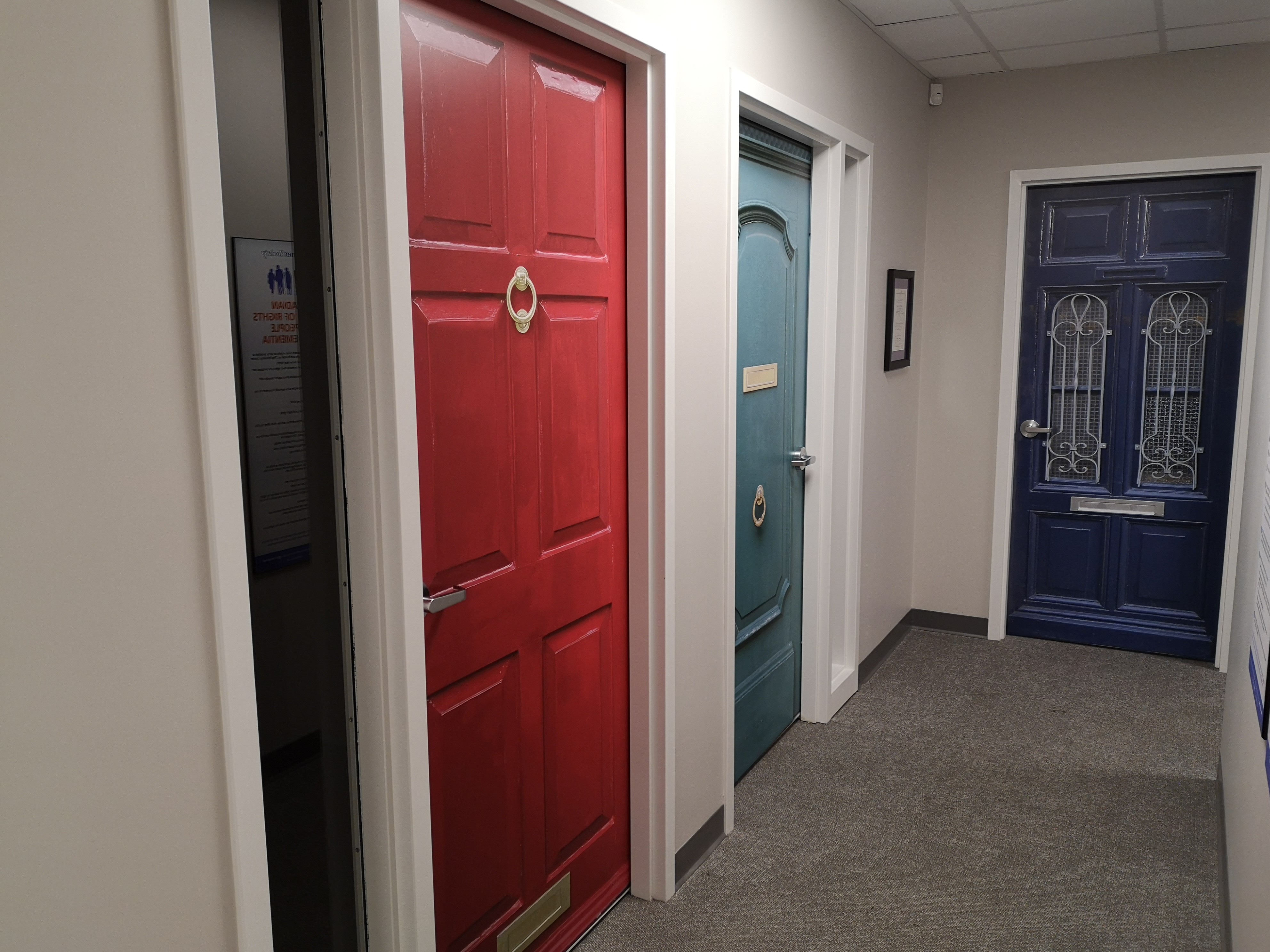
Doors
- We chose doors with lever handles rather than round knobs. Lever handles are less confusing than round knobs, and can be easier to operate.
- We chose to place True Doors® decals on each of our office doors.
- True Doors® decals are person centred solutions that can assist with wayfinding, while also transforming spaces into warm and familiar home-like environments.
- Each of our employees chose their own True Doors® decal that had meaning for them.
Flooring
- We chose a neutral, pattern-free carpet for a few reasons:
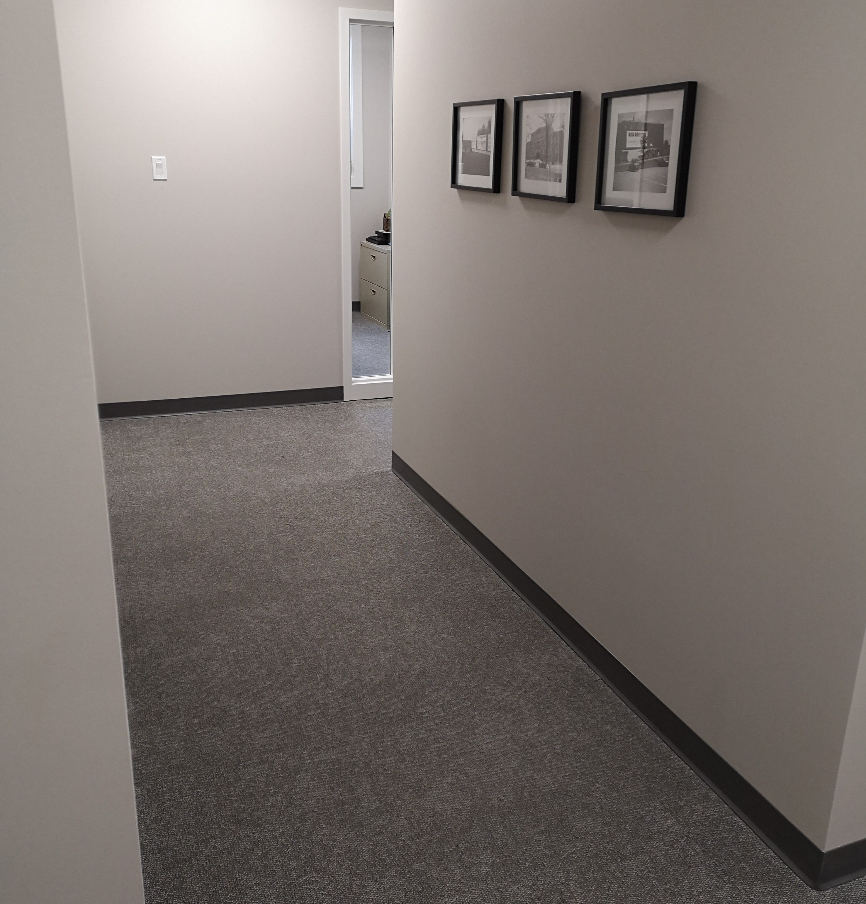
- Dementia can cause difficulty with spatial orientation and may cause everyday objects to be perceived differently.
- Reflective or shiny flooring can be very confusing for those living with dementia as it can be perceived as wet or look like water.
- Dark flooring or tiles can look like a hole in the floor, and speckled or patterned flooring can look like there is dirt on the floor.
- Misperceptions about the floor can cause confusion, fear, and even frustration.
- Another benefit of carpeting is that it helps to absorb sound, reducing overstimulation and potential confusion.
Wall colour
- Difficulties with sight and perception can cause people to misinterpret the world around them, further fuelling the confusion and isolation they’re already feeling.
- The use of different, contrasting colours has been proven to make life a little easier for those living with dementia.
- Contrasting colours can also assist with wayfinding.
- In our space, we chose a neutral colour that could easily be contrasted with darker or lighter hues. This colour distinguishes or camouflages certain rooms in the space and highlights certain objects, like the toilet seat in the bathroom.
Furniture
- Wherever possible, we chose simple furniture that clearly indicated the purpose of the space.
- Some more modern furniture, especially if it is abstract, may not clearly indicate the room’s purpose.
Lighting
- Lighting is important in dementia-friendly spaces:
- Well-lit rooms help compensate for the deterioration in vision that may occur as dementia progresses.
- A well-lit room throughout the day helps regulate circadian rhythm, and eliminate possible sources of confusion with shadows.
- To help achieve this, we leave blinds open as much as possible, allowing the space to be lit with natural light, and use higher watt lightbulbs.
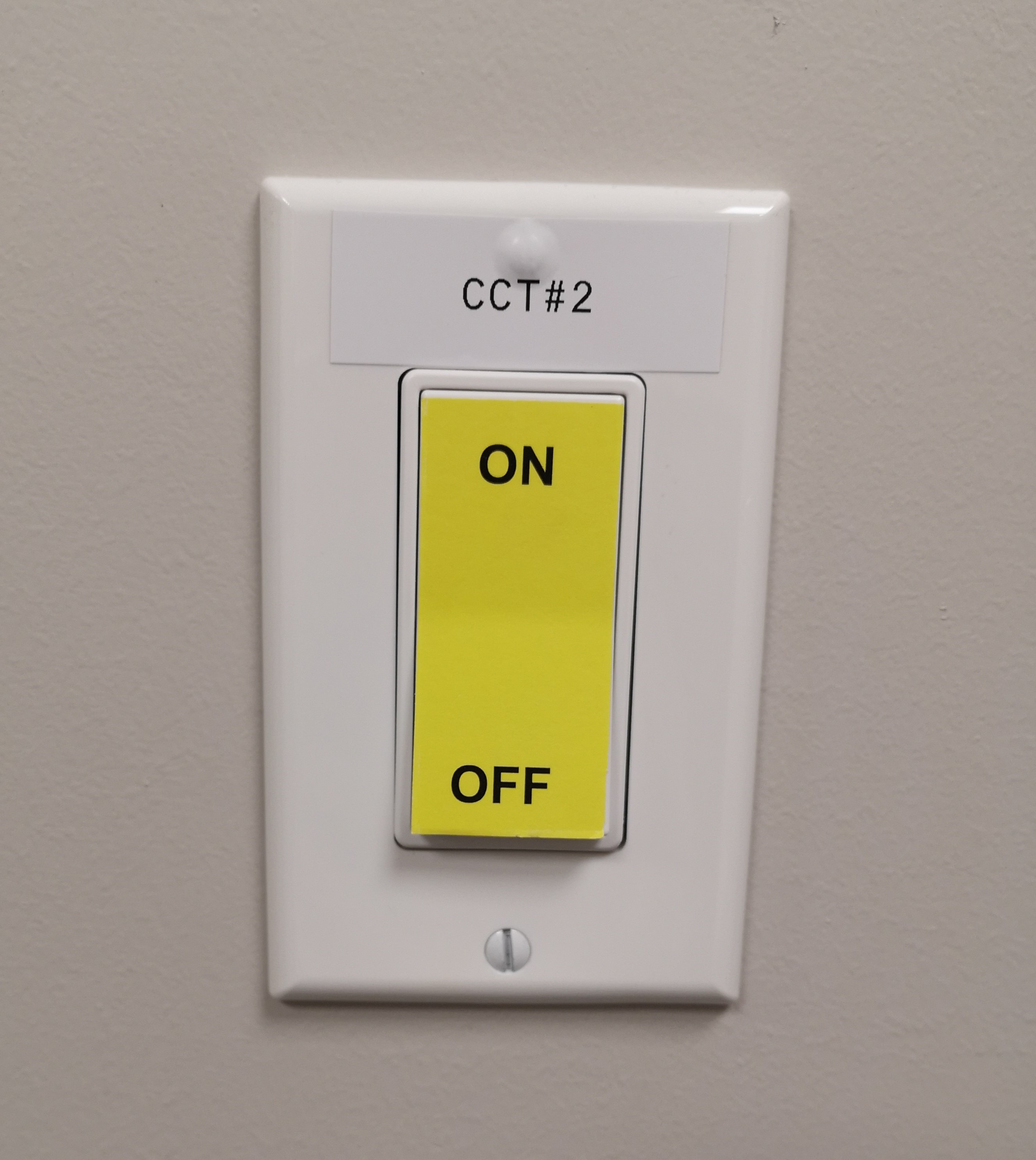
Light switches
- Because we have push button switches rather than the traditional toggle switches, we decided to use a label on each appropriate space in a highly contrasting colour, indicating where the on and off positions are.
Signage
To aid with wayfinding and ease of navigation, we placed directional signage at all decision points to clearly identify where various rooms and spaces are within the office. The design of these signs is very intentional, and incorporates several dementia-friendly elements.
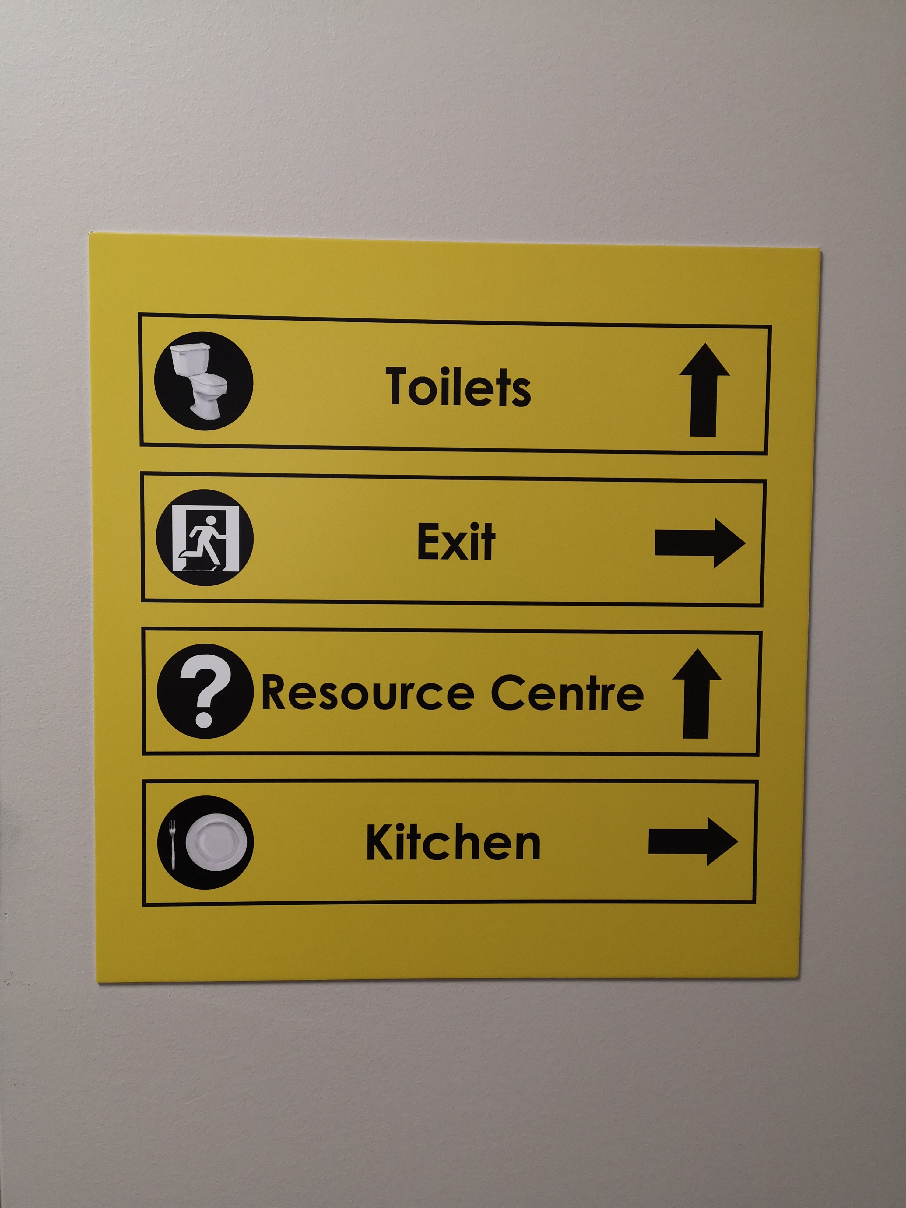
Most of the signage in our space is yellow and black; research shows this colour combination lasts for the longest in human eyes.
Design
- On all signage we chose to use a clear, literal image to help with cueing and wayfinding, a word in clear, simple text and a directional arrow.
- The material of the signs is non-reflective to avoid glare.
Placement
- All signs were placed at eye level to make them easier to spot and easier to read.
Rooms
- Rooms in our office have been named based on their purpose.
- For spaces that don't have a clear purpose (such as our storage areas), we chose not to label doors to avoid drawing attention to these rooms.
Exit
- Small exit signs have been placed on the back of each door.
- Because the doors are a similar colour to the walls, we had to ensure it's clear where the exit is in each room when the door is closed.
Lobby and stairwell
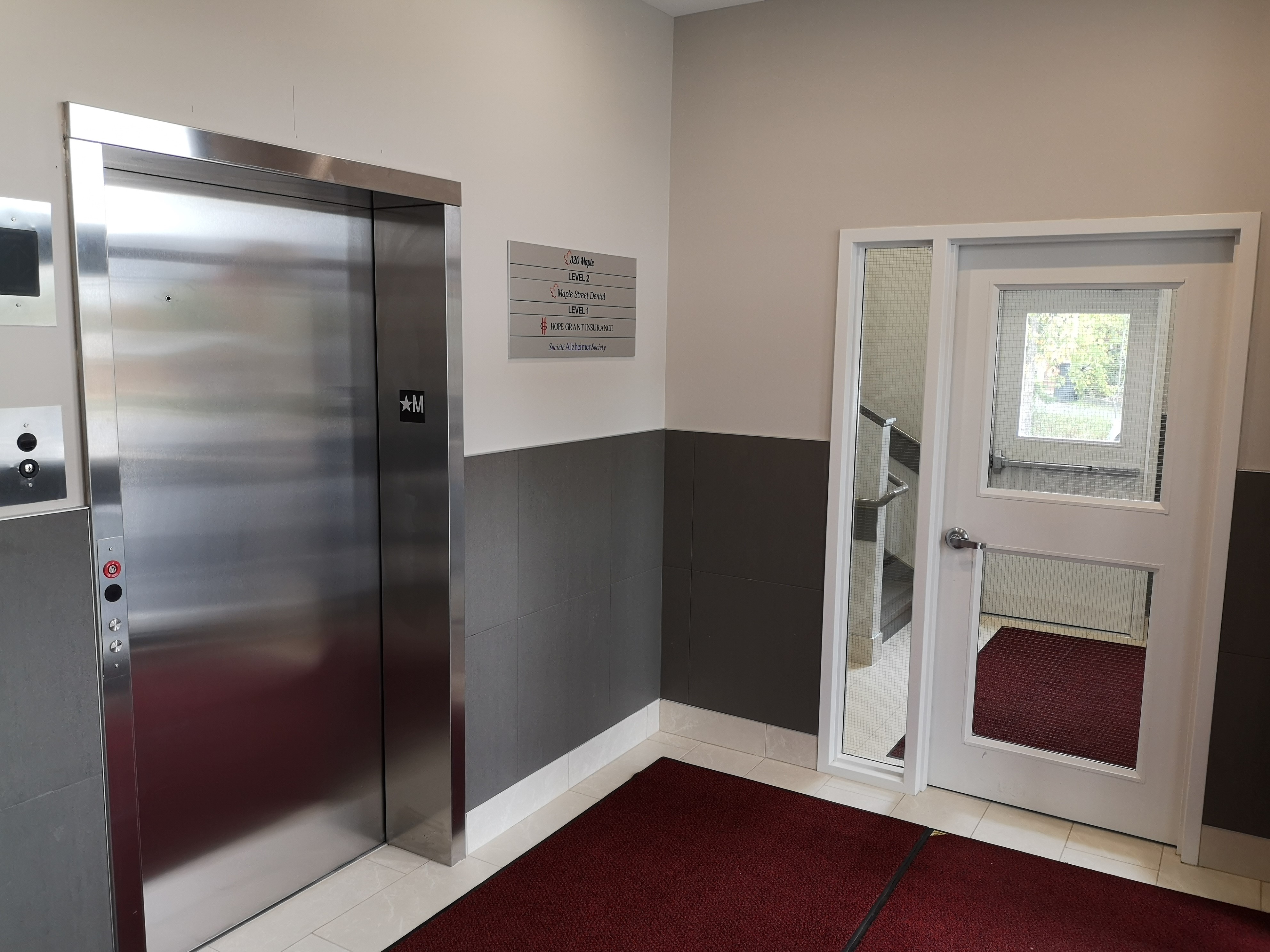
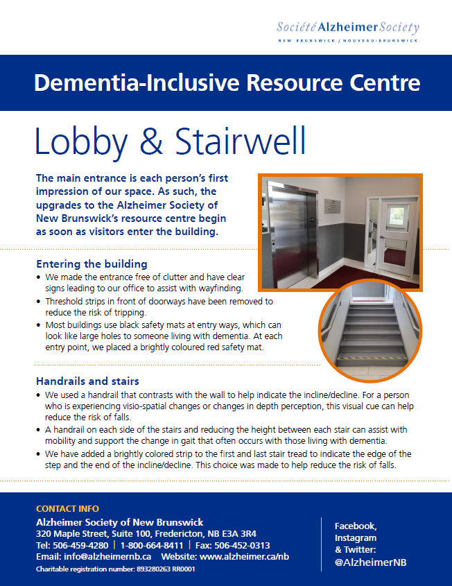
The main entrance is each person's first impression of our space. As such, the upgrades to the Alzheimer Society of New Brunswick's resource centre begin as soon as visitors enter the building.
Entering the building
- We made the entrance free of clutter and have clear signs leading to our office to assist with wayfinding.
- Threshold strips in front of doorways have been removed to reduce the risk of tripping.
- Most buildings use black safety mats at entry ways, which can look like large holes to someone living with dementia. At each entry point, we placed a brightly coloured safety mat.
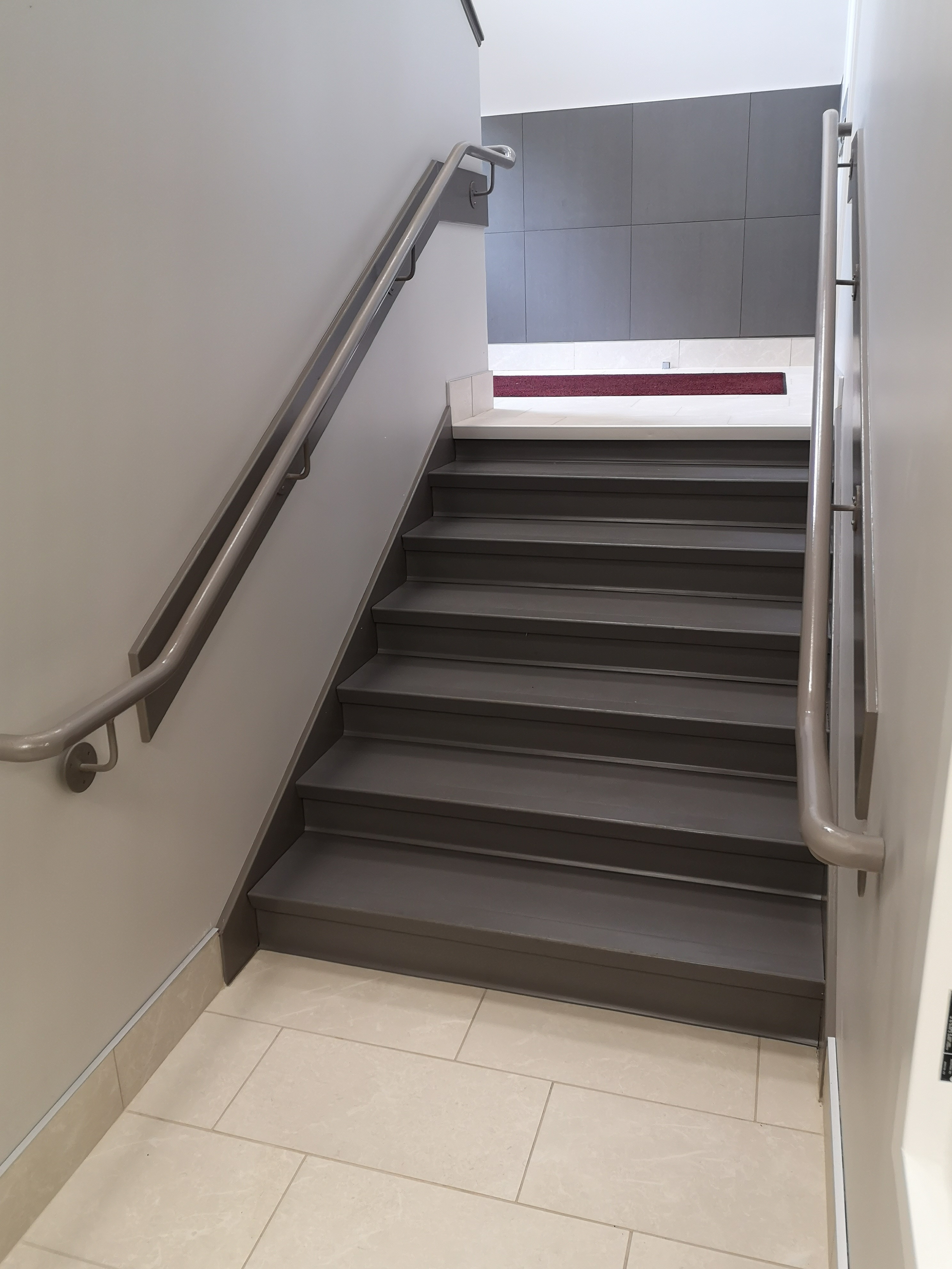
Handrails and stairs
- We used a handrail that contrasts with the wall to help indicate the incline/decline. For a person who is experiencing visio-spatial changes or changes in depth perception, this visual cue can help reduce the risk of falls.
- A handrail on each side of the stairs and reducing the height between each stair can assist with mobility and support the change in gait that often occurs with those living with dementia.
Kitchen
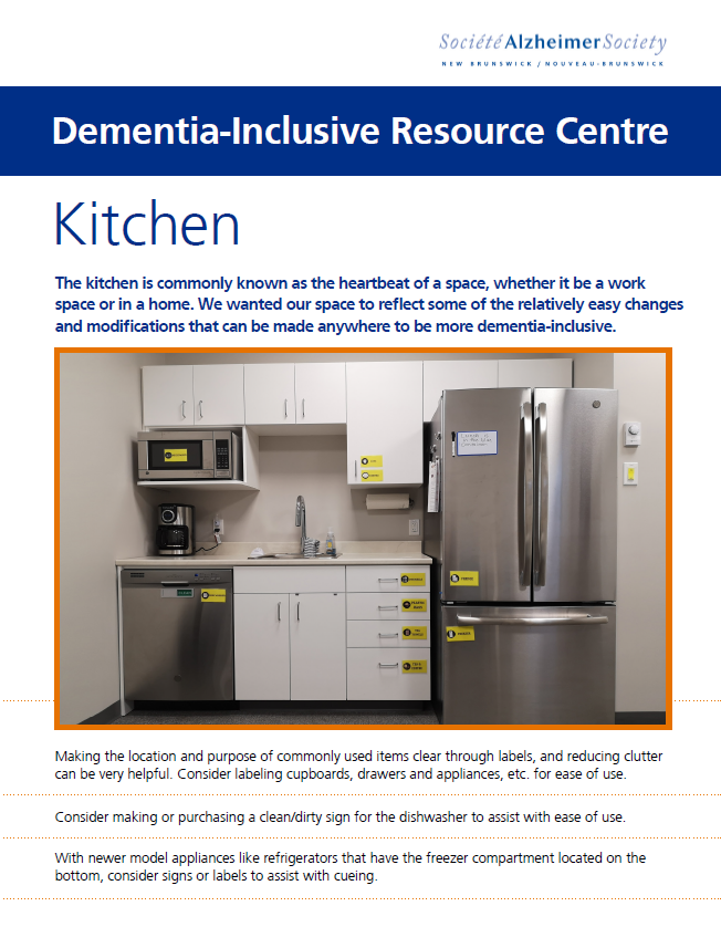
The kitchen is commonly known as the heartbeat of a space, whether it be at the office or at home. We wanted our space to reflect some relatively easy changes and modifications that can be made anywhere to be more dementia-inclusive.
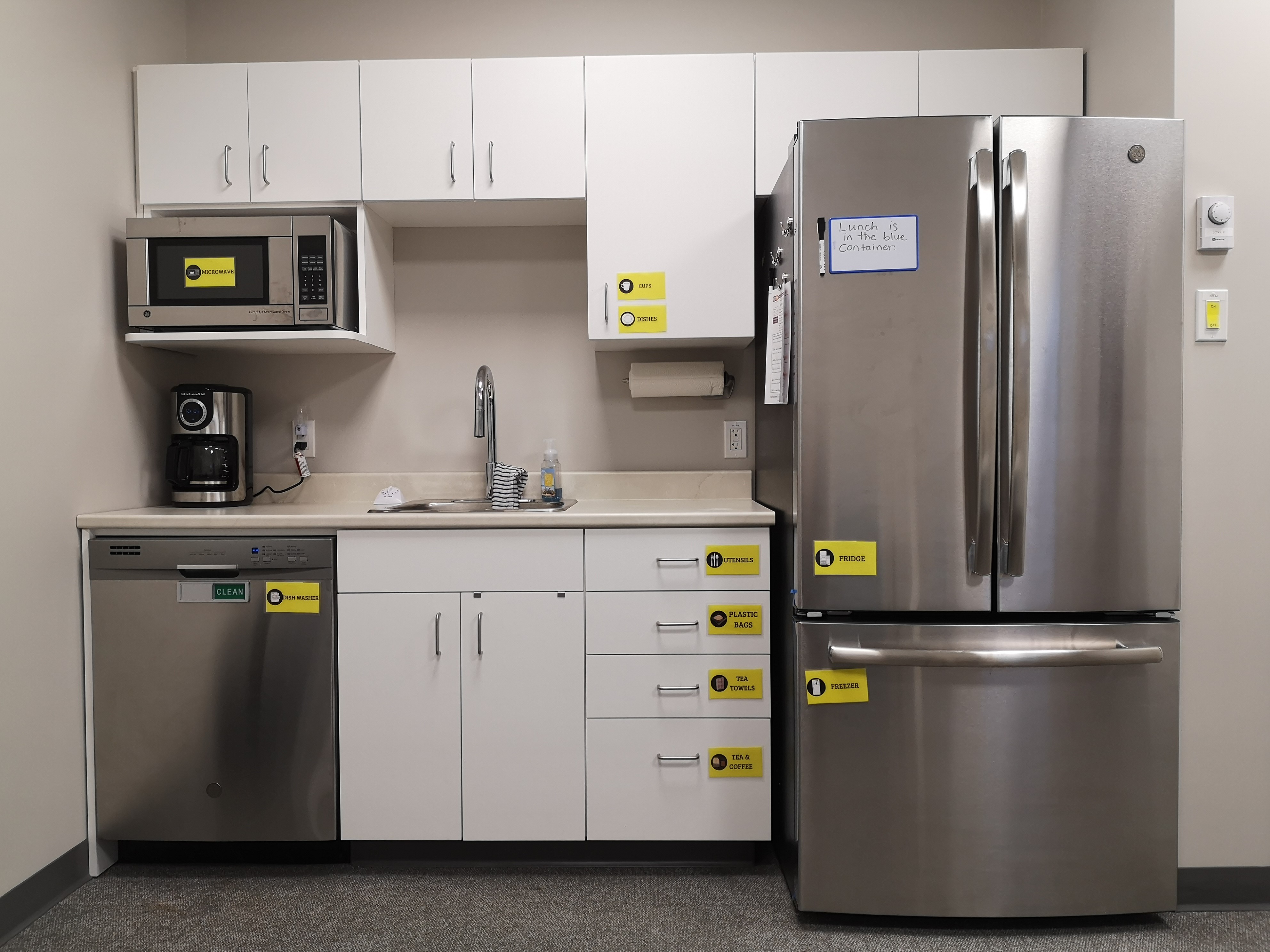
Generally, it's helpful to reduce clutter and make the location and purpose of commonly-used items clear through labels.
Appliances
- A clean/dirty sign for the dishwasher is helpful.
- With newer model appliances like refrigerators or microwaves, consider signs or labels to assist with cueing. We created our own labels by drawing them, printing them, and then pressing them in laminating paper.
- If buttons on appliances are not clearly labelled, label them. This makes the use of appliances much easier.
- Have an emergency plan on the fridge.
- Install a device to automatically turn off the stove after a certain period of inactivity.
Cupboards and drawers
- Clearly label all cupboards and drawers. This eliminates the question of what is behind each door. Alternatively, consider removing cupboard doors.
- Purchase brightly coloured dinnerware to help contrast with both the table and food, or if more appropriate, use a brightly coloured contrasting placemat.
- To avoid cluttered cupboards, install extra shelves or hooks.
- Keep cleaning supplies and dish soap out of sight so they won't be confused with cooking ingredients.
- Store food in clear plastic containers to prevent confusion and frustration.
Sinks
- Consider installing hardware under the sink to help with accessing stored items.
- Label taps "hot" and "cold."
- Install scald prevention plugs that can sense temperature. These are useful to prevent burns in the kitchen sink.
Other things to consider
- Using notes or a timer for reminders can be helpful.
- Avoid decorations that look edible. People with dementia may not have the cognitive ability to distinguish between fake and real food.
- Mark date of purchase on food to reduce risk of eating moldy or expired food.
Bathroom
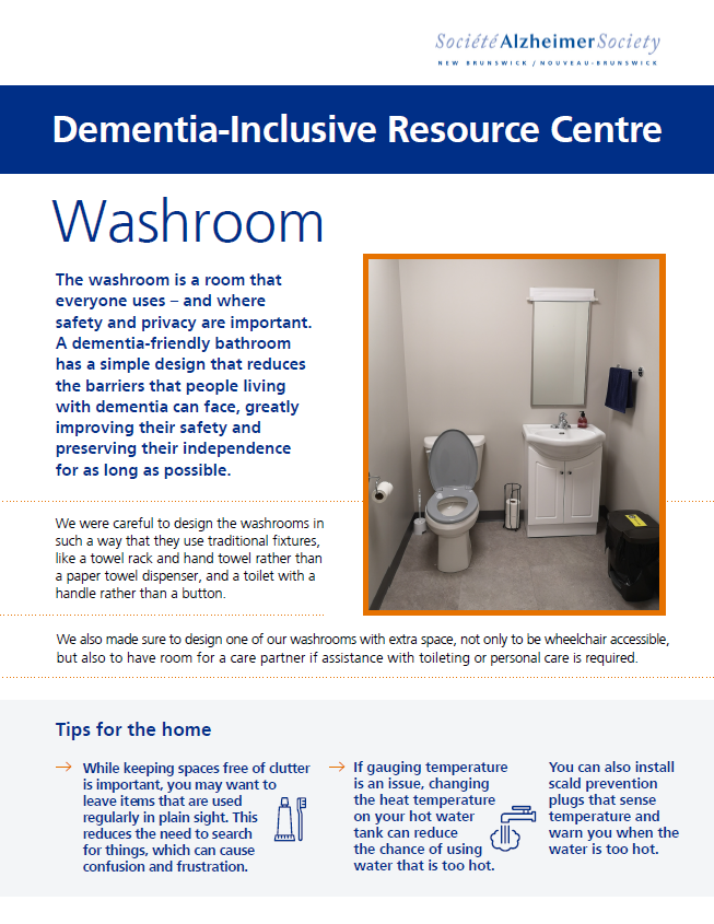
The washroom is the one room that everyone uses – and where safety and privacy are important. A dementia-friendly bathroom has a simple design that reduces the barriers that people living with dementia can face, greatly improving their safety and preserving their independence for as long as possible.
Accessibility
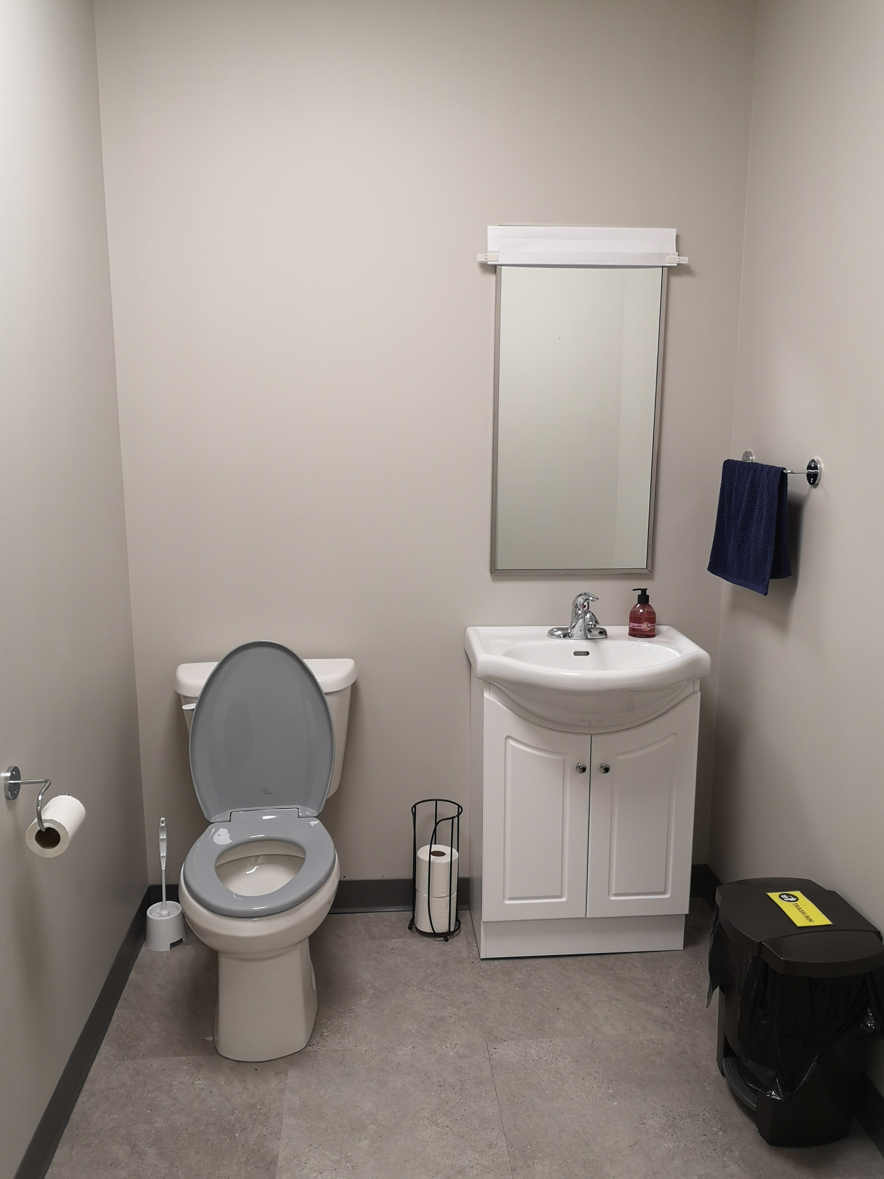
- We designed the washrooms with traditional fixtures, like a towel rack and hand towel rather than a paper towel dispenser, and a toilet with a handle rather than a button.
- We designed one of our washrooms with extra space, not only to be wheelchair accessible, but also to have room for a family caregiver if assistance with toileting or personal care is required.
- Clearly label garbage cans and ensure they are away from the toilet so the two won't be confused, and so that soiled toilet paper does not get misplaced.
Toilets
- We chose toilet seats that are contrasting colours to the toilets, the floors and the walls. This helps with cueing when the person with dementia is experiencing diminished perception. We also chose a soft close lid to reduce noise.
Toilet paper
- Keep extra toilet paper in sight rather than under the sink
- Place the toilet paper holder on the wall rather than using a holder that is free-standing so that it is not a tripping or falling hazard. Ensure the holder is placed within view, and not too far of a reach when sitting on the toilet to prevent a potential fall.
At the sink
- Place the towel rack close to the sink so that it's in view when washing one's hands. Choose a towel that contrasts in colour with the wall.
- If a person with dementia is bothered or confused by their reflection, consider placing a blind that can be lowered over the mirror.
Tip sheets
Below are several tip sheets that outline changes we made to our Dementia-Inclusive Resource Centre and information on how to implement them in your home or office.
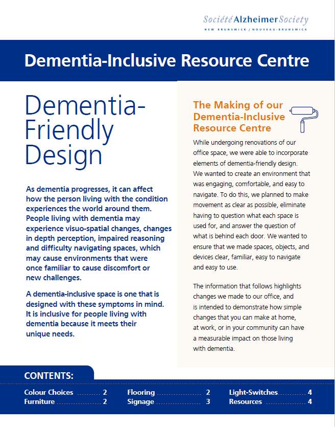
In this tip sheet, learn about general tips for flooring, furniture, colour choices, and more.
In this tip sheet, learn about tips for a dementia-friendly kitchen environment.
In this tip sheet, learn about tips for a dementia-friendly bathroom environment.
In this tip sheet, learn about how to incorporate elements of dementia-friendly design into the lobby and stairwell.
More useful links and resources
Want to learn more about dementia-friendly spaces? Check out these resources!
Making your home dementia friendly. Alzheimer's Society UK, 2017. This booklet describes some of the ways to create a home environment that supports you as a person with dementia, and doesn’t become confusing or restrict you.
https://www.nia.nih.gov/health/home-safety-checklist-alzheimers-disease
Home safety checklist for Alzheimer's disease. National Institute on Aging (NIH). The NIH provides a room-by-room checklist to alert you to potential hazards for people living with dementia.
https://alzheimer.ca/en/Home/Living-with-dementia/Day-to-day-living/Safety/Safety-in-the-home
Making your environment safe. Alzheimer Society of Canada. On this page, learn about what you need to do to make the space around you dementia-friendly and accessible, whether it's at home or in the office.
